Seattle is famous for its vibrant café culture, delicious food, and trendy dining spots. Whether in a cozy coffee shop, a casual eatery, or an upscale restaurant, interior painting choices play a huge role in creating the right atmosphere. In the Seattle area, where the weather is often cloudy and rainy, the colors used in property painting can transform spaces into warm, inviting places people love to visit.
This article explores the most common interior paint colors used in restaurants and cafés around Seattle and why these colors are so popular. The right color can set the tone, make customers feel comfortable, and reflect the overall style of the business.

Warm Neutrals (Beige, Light Gray, and Taupe)
Why They Are PopularWarm neutral colors like beige, light gray, and taupe are top choices for interior painting in Seattle restaurants and cafés. These soft, calming tones create a cozy welcoming environment, even when the skies outside are gray. Commercial painting experts often recommend warm neutrals because they appeal to a broad range of customers, making them versatile and timeless.
How They Affect the Space
Neutrals provide a great backdrop for other design elements. In small cafés, these colors make spaces feel larger and brighter, while in fine-dining restaurants, they add a touch of sophistication. Because warm neutrals are easy to match with furniture and décor, they are a popular choice for property painting in Seattle, where owners want flexibility in styling their interiors.
Earthy Tones (Terracotta, Olive Green, and Brown)
Why They Are Popular
Seattle’s natural beauty inspires many restaurants and cafés to use earthy tones like terracotta, olive green, and brown. These colors bring the outdoors inside, creating a connection to the region’s forests and mountains. Earthy tones are a favorite in property painting because they make the space feel warm and grounded.
How They Affect the Space
Earthy tones create a relaxed and comfortable atmosphere, perfect for cafés and restaurants that want to provide a homey feel. Terracotta adds warmth, olive green has a calming effect, and brown gives a sense of stability and comfort. These colors are often used in commercial painting projects where businesses want to reflect a rustic, natural aesthetic. Combined with wooden furniture or natural accents, earthy tones enhance the cozy vibe that so many Seattle eateries aim for.
Bold Reds and Oranges
Why They Are Popular
Reds and oranges are known for stimulating appetite, which makes them a popular choice in the interior painting of restaurants and cafés, especially casual dining spots. These bold colors add energy and excitement to a room, which can help draw in customers and create a lively atmosphere.
How They Affect the Space
Bold reds and oranges make the space feel more vibrant and dynamic. They are often used in commercial painting projects for fast-casual restaurants and cafés that want to create an energetic, upbeat environment. For example, a red accent wall can highlight the counter or menu board, while an orange adds warmth and cheerfulness to the room. These colors encourage people to come in, eat quickly, and leave happy.
Soft Pastels (Pale Pink, Mint Green, and Light Blue)
Why They Are Popular
Pastel colors have become very trendy in Seattle’s café scene, especially in newer coffee shops and bakeries. Soft pinks, mint greens, and light blues create a soothing, friendly atmosphere that makes customers feel at ease. Many businesses use pastel colors for interior painting to reflect a modern, stylish aesthetic that appeals to a younger crowd.
How They Affect the Space
Pastels help make a room feel light and airy, perfect for spaces with natural light or open layouts. Pale pinks create a playful, charming vibe, while mint green and light blue add a fresh, relaxing feel. In property painting, these colors are often used to make small or narrow spaces appear larger and more open. They are perfect for cafes or restaurants that want to feel inviting but also trendy and modern.
Deep Blues and Greens
Why They Are Popular
Deep colors like navy blue and forest green are favorites in high-end Seattle restaurants and intimate cafés. These rich tones give the space a sense of luxury and elegance. For commercial painting projects focused on creating a more upscale dining experience, deep blues and greens are an excellent choice.
How They Affect the Space
These colors add depth and richness to a room, making it feel more intimate and private. Deep blues create a calm and sophisticated atmosphere, while forest green adds a natural, earthy elegance. Property painting with these colors works well in spaces where businesses want to create a more personal, cozy dining environment. Paired with dim lighting and wood accents, these shades can transform any space into a peaceful, luxurious haven.
Black and Charcoal
Why They Are Popular
Black and dark gray (charcoal) has become increasingly popular in modern restaurants and cafés across Seattle. These colors add a sense of sophistication and create a sleek, minimalist look. Businesses that focus on a modern or industrial aesthetic often turn to these shades for their interior painting projects.
How They Affect the Space
Black is bold and dramatic, adding instant style to any room. It’s often used as an accent color or to create contrast with lighter elements in the space. Charcoal, on the other hand, is slightly softer but still gives off a chic, modern vibe. These colors are popular in commercial painting because they make a strong statement without overwhelming the space. Used thoughtfully, they can create a stylish and elegant atmosphere, perfect for contemporary eateries.
Yellow
Why It’s Popular
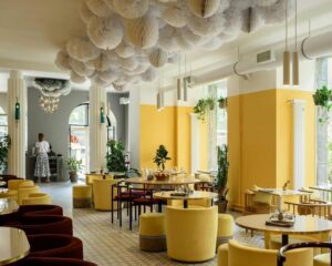
Yellow is a bright, cheerful color that can instantly lift the mood of a room. In Seattle, where the weather can be overcast for much of the year, yellow is used to bring warmth and light into cafés and restaurants. For interior painting, it’s often chosen for breakfast spots and diners where a happy, upbeat atmosphere is key.
How It Affects the Space
Yellow brightens up a room and makes it feel warm and inviting. Lighter yellows create a spacious, open feel, while deeper yellows add richness and warmth. Many businesses in Seattle use yellow in their commercial painting projects to make spaces feel sunny and joyful, even on cloudy days. This color is perfect for businesses looking to create a positive, happy vibe that keeps customers coming back.
White
Why It’s Popular
White is timeless and versatile, making it a go-to color for many restaurants and cafés. In Seattle, white interiors help reflect light, making the space feel larger and brighter, which is particularly important during the city’s long, gray winters.
How It Affects the Space
White makes any room feel clean, fresh, and open. It’s often used as a neutral backdrop for colorful furniture, artwork, or plants. Many Seattle eateries choose white for their property painting projects because it makes the space feel bright and airy. It also provides flexibility for future changes in décor or layout, making it easy to update the look without repainting. White is perfect for minimalist designs, giving off a modern and clean appearance.
Choosing the right interior paint color for restaurants and cafés in Seattle is key to creating the perfect atmosphere. Whether it’s the cozy feel of warm neutrals, the natural charm of earthy tones, or the bold energy of reds and oranges, the right colors can transform a dining space. In commercial painting, these choices not only reflect the business’s style but also make a big impact on how customers feel when they walk through the door.
For business owners in Seattle, working with a professional painting contractor who understands the local market and style trends is essential. Interior painting can completely change the mood of a space, and selecting the right colors can ensure that customers feel welcome, relaxed, and eager to return.


